
George Lam — Senior Product Designer
Senior Product Designer · 10+ years · Tokyo
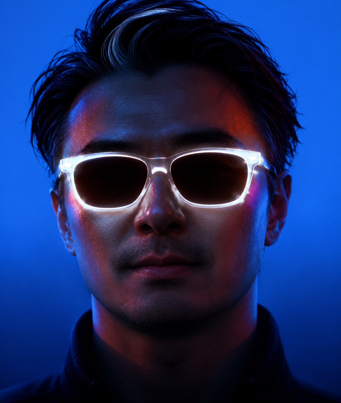
Design that lifts adoption
- Product Design
- UX/UI
- Design Systems
- AI-assisted workflow
- +61%
- Passkey adoption
- −30%
- SMS costs
- +15.28%
- Conversion
WORK THAT
MATTERS.
Four product case studies from Paidy, Philip Morris Japan and Rakuten, each with the decision I made and what it changed.
Process leadership: I also initiated a shared UX validation framework at Paidy, so Design, Product and Engineering use the same checkpoints for deciding when a design is ready to build.
Read the short caseWhere I’ve
worked.
Senior Product Designer based in Tokyo, specializing in fintech, growth, design systems, and complex product experiences.
Paidy
PayPal Group · Senior UX DesignerPasskey authentication, Apple Wallet eKYC nudges, merchant dashboard and component design, and a shared UX validation framework.
Philip Morris Japan
UX/UI Design LeadLed UX for the localized IQOSPHERE e-commerce and loyalty experience across web and LINE.
Rakuten
UX/UI DesignerModernized the Rakuten Travel search and booking journey, validated through in-person usability testing.
One flow,
rethought.
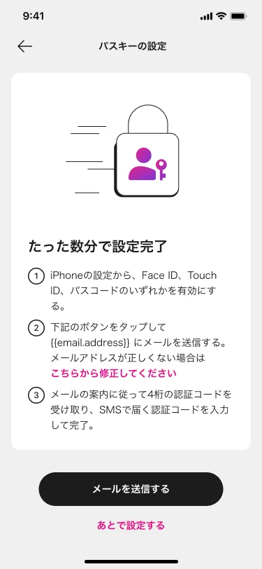
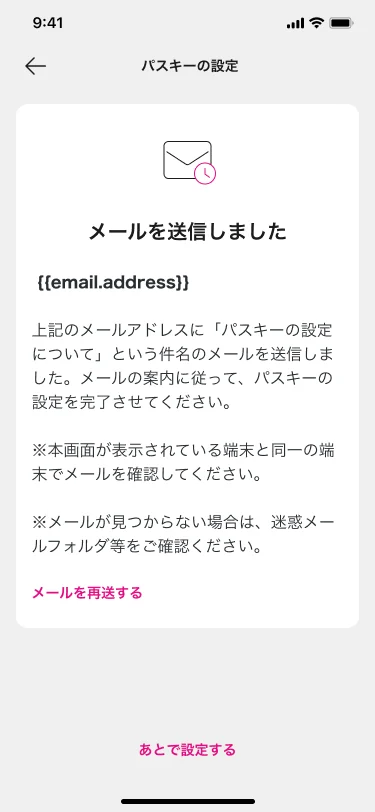
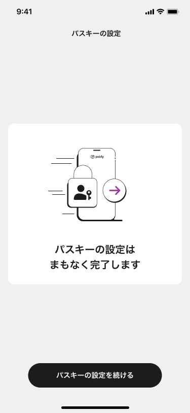
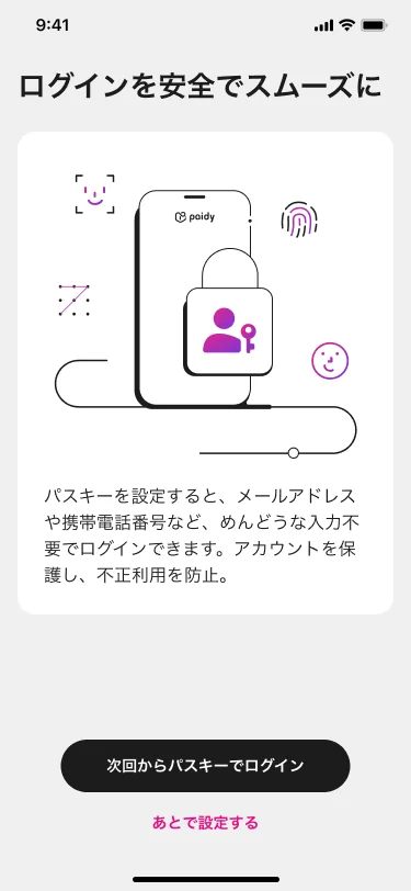
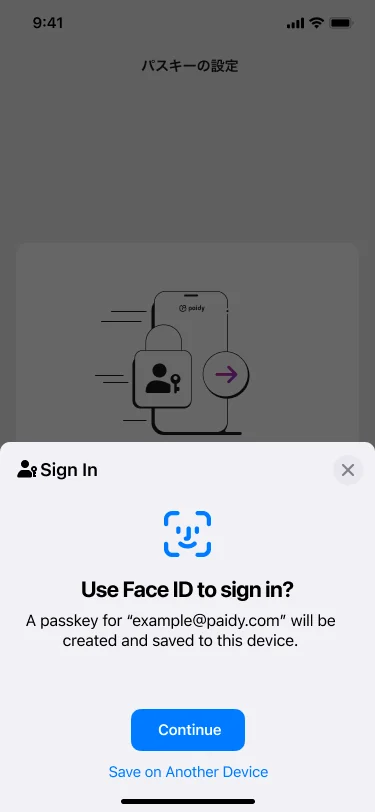
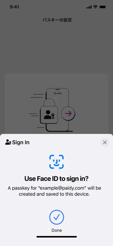
Paidy Passkey setup. Before: instructions, an email check and a second verification before Face ID. After: explain the benefit, hand off to native Face ID, done.
Selected Projects
Four product case studies and one process-leadership case, from Paidy, Philip Morris Japan and Rakuten.
George Lam
I simplify complex products and turn user behavior into measurable growth.
Senior Product Designer (UX/UI) · Fintech • Growth • Design Systems • Product Strategy • AI Workflow
About
I turn complex product journeys into experiences people can understand and trust.
I’m a Senior Product Designer with 10+ years designing digital products in Japan, after an earlier career in advertising and brand design in Canada and Hong Kong. My work spans Passkey authentication, identity verification (eKYC), merchant tools, loyalty, travel booking and design systems.
I lead cross-functional alignment from discovery through delivery—clarifying product direction, making trade-offs visible, facilitating decisions, and building reusable systems that help Product, Engineering, Research, and business teams move together. I use research and analytics to identify friction, validate decisions with users, and measure what changes after launch.
How I use AI
I use Figma and Claude as part of my everyday workflow, while research findings and product decisions stay with the team:
- Concept exploration: generating and comparing layout and flow directions quickly before choosing which to prototype properly.
- Research synthesis: clustering interview notes and feedback into themes, which I then check against the source material.
- Copy and flow variations: drafting alternative microcopy and step orders to test before committing engineering time.
- Design-system documentation: writing component usage notes and keeping specs consistent. This portfolio and its design system were built the same way.
Languages English · Cantonese · Mandarin (advanced) · Japanese (JLPT N3)
Leadership & influence
How I Work
Understand the Real Problem
I begin by identifying user needs, behavioral friction, business objectives, and technical constraints before exploring solutions.
Validate with Evidence
I use research, analytics, customer feedback, prototypes, and usability testing to reduce assumptions and validate product decisions before development.
Design for Measurable Outcomes
I connect design decisions to clear success measures, including adoption, conversion, retention, task completion, and operational efficiency.
Build for Scale
I create reusable patterns, component libraries, and design frameworks that improve consistency and help Product, Design, and Engineering work more efficiently.
Collaborate Across Functions
I work closely with Product, Engineering, Research, Marketing, and business stakeholders from problem definition through implementation and validation.
Where I’ve worked
Experience across fintech, travel and consumer products.
Paidy
PayPal Group · Senior UX Designer · 2023 – nowPasskey authentication, Apple Wallet eKYC nudges, merchant dashboard and component design, and a shared UX validation framework.
See the work → 02Philip Morris Japan
UX/UI Design Lead · 2020 – 2022Led UX for the localized IQOSPHERE e-commerce and loyalty experience across web and LINE.
See the work → 03Rakuten
UX/UI Designer · 2016 – 2020Modernized the Rakuten Travel search and booking journey, validated through in-person usability testing.
See the work →Outside of Work
Outside of design, I enjoy traveling, cooking, exploring cafés, and noticing thoughtful product experiences in everyday life. I believe good design exists beyond digital interfaces, and staying curious helps me bring fresh perspectives to my work.
GET IN
TOUCH ↗
I’m open to Senior and Lead Product Designer roles in Japan and with international teams.
Design system
Atomic design for this portfolio: foundations, atoms, molecules, organisms, templates and pages.
Principles
1. Tokens first: every color, size and motion value comes from a named token. 2. Compose upward: atoms build molecules, molecules build organisms, organisms fill templates. 3. One accent: lime marks the primary action; blue is the brand surface. 4. Accessible by default: 4.5:1 text contrast, 44px touch targets, visible focus, reduced motion respected.
1 · Foundations
Color, typography, spacing, radius, elevation and motion. Edit a token once and the whole site follows.
--ease-out · fast .25s (hover) · base .5s (reveal) · slow .8s (scroll reveal). All motion stops when the visitor prefers reduced motion.2 · Atoms
The smallest reusable parts. They never depend on a page.
3 · Molecules
Atoms combined into one job.
Validate with Evidence
Research, analytics and testing reduce assumptions before development.
4 · Organisms
Complete interface sections made of molecules.
The Challenge
Section title on the left, content on the right; stacks on mobile.
5 · Templates & pages
Organisms placed into page layouts. Breakpoints: 600px and 900px. Pages use a 16px gutter on phones and 32px on desktop.
| Template | Organisms |
|---|---|
| Home | Hero · scrolling strip · results · work rows · experience · approach · footer |
| Projects | Top bar · title · project cards · footer |
| Case study | Top bar · hero card · stats · overview · case sections · gallery · next project · footer |
| About | Top bar · title · portrait · stats · sections · company cards · footer |
| Contact | Title · details · form |
Accessibility checks
| Pair | Contrast |
|---|---|
| Navy on lime (buttons) | 15.6 : 1 |
| White on brand blue | 6.0 : 1 |
| Ink on white | 19.6 : 1 |